ae_attendances dataset
Tom Jemmett, The Strategy Unit
Source:vignettes/ae_attendances.Rmd
ae_attendances.RmdThis vignette explains how to use the ae_attendances
dataset in R, and also details where it comes from and how it is
generated.
The data is sourced from NHS England Statistical Work Areas and is available under the Open Government Licence v3.0.
The data contains all reported A&E attendances for the period April 2016 through March 2019
The dataset contains:
- period: the month that this activity relates to, stored as a date (1st of each month)
- org_code: the ODS code for the organisation that this activity relates to
- type: the Department Type for this activity, either 1, 2, or other
- attendances: the number of attendances for this department type at this organisation for this month
- breaches: the number of attendances that breached the 4 hour target
- admissions: the number of attendances that resulted in an admission to the hospital
First let’s load some packages and the dataset and show the first 10 rows of data.
library(knitr)
library(scales)
library(ggrepel)
#> Loading required package: ggplot2
library(lubridate)
#>
#> Attaching package: 'lubridate'
#> The following objects are masked from 'package:base':
#>
#>     date, intersect, setdiff, union
library(dplyr)
#>
#> Attaching package: 'dplyr'
#> The following objects are masked from 'package:stats':
#>
#>     filter, lag
#> The following objects are masked from 'package:base':
#>
#>     intersect, setdiff, setequal, union
library(forcats)
library(tidyr)

library(NHSRdatasets)

data("ae_attendances")

# format for display
ae_attendances %>%
  # set the period column to show in Month-Year format
  mutate_at(vars(period), format, "%b-%y") %>%
  # set the numeric columns to have a comma at the 1000's place
  mutate_at(vars(attendances, breaches, admissions), comma) %>%
  # show the first 10 rows
  head(10) %>%
  # format as a table
kable()| period | org_code | type | attendances | breaches | admissions |
|---|---|---|---|---|---|
| Mar-17 | RF4 | 1 | 21,289 | 2,879 | 5,060 |
| Mar-17 | RF4 | 2 | 813 | 22 | 0 |
| Mar-17 | RF4 | other | 2,850 | 6 | 0 |
| Mar-17 | R1H | 1 | 30,210 | 5,902 | 6,943 |
| Mar-17 | R1H | 2 | 807 | 11 | 0 |
| Mar-17 | R1H | other | 11,352 | 136 | 0 |
| Mar-17 | AD913 | other | 4,381 | 2 | 0 |
| Mar-17 | RYX | other | 19,562 | 258 | 0 |
| Mar-17 | RQM | 1 | 17,414 | 2,030 | 3,597 |
| Mar-17 | RQM | other | 7,817 | 86 | 0 |
We can calculate the 4 hours performance for England as a whole like so:
england_performance <- ae_attendances %>%
  group_by(period) %>%
  summarise_at(vars(attendances, breaches), sum) %>%
  mutate(performance = 1 - breaches / attendances)

# format for display
england_performance %>%
  # same format options as above
  mutate_at(vars(period), format, "%b-%y") %>%
  mutate_at(vars(attendances, breaches), comma) %>%
  # this time show the performance column as a percentage
  mutate_at(vars(performance), percent) %>%
  # show the first 10 rows and format as a table
  head(10) %>%
kable()| period | attendances | breaches | performance |
|---|---|---|---|
| Apr-16 | 1,867,781 | 186,122 | 90.0351% |
| May-16 | 2,070,340 | 201,329 | 90.2756% |
| Jun-16 | 1,958,802 | 184,912 | 90.5599% |
| Jul-16 | 2,079,034 | 201,973 | 90.2852% |
| Aug-16 | 1,932,901 | 174,419 | 90.9763% |
| Sep-16 | 1,952,464 | 182,597 | 90.6479% |
| Oct-16 | 2,001,816 | 219,137 | 89.0531% |
| Nov-16 | 1,907,871 | 221,713 | 88.3790% |
| Dec-16 | 1,944,567 | 268,818 | 86.1759% |
| Jan-17 | 1,895,272 | 281,612 | 85.1413% |
We can now plot the monthly performance
ggplot(england_performance, aes(period, performance)) +
  geom_line() +
  geom_point() +
  scale_y_continuous(labels = percent) +
  labs(
    x = "Month of attendance",
    y = "% of attendances that met the 4 hour standard",
    title = "NHS England A&E 4 Hour Performance",
    caption = "Source: NHS England Statistical Work Areas (OGL v3.0)"
  )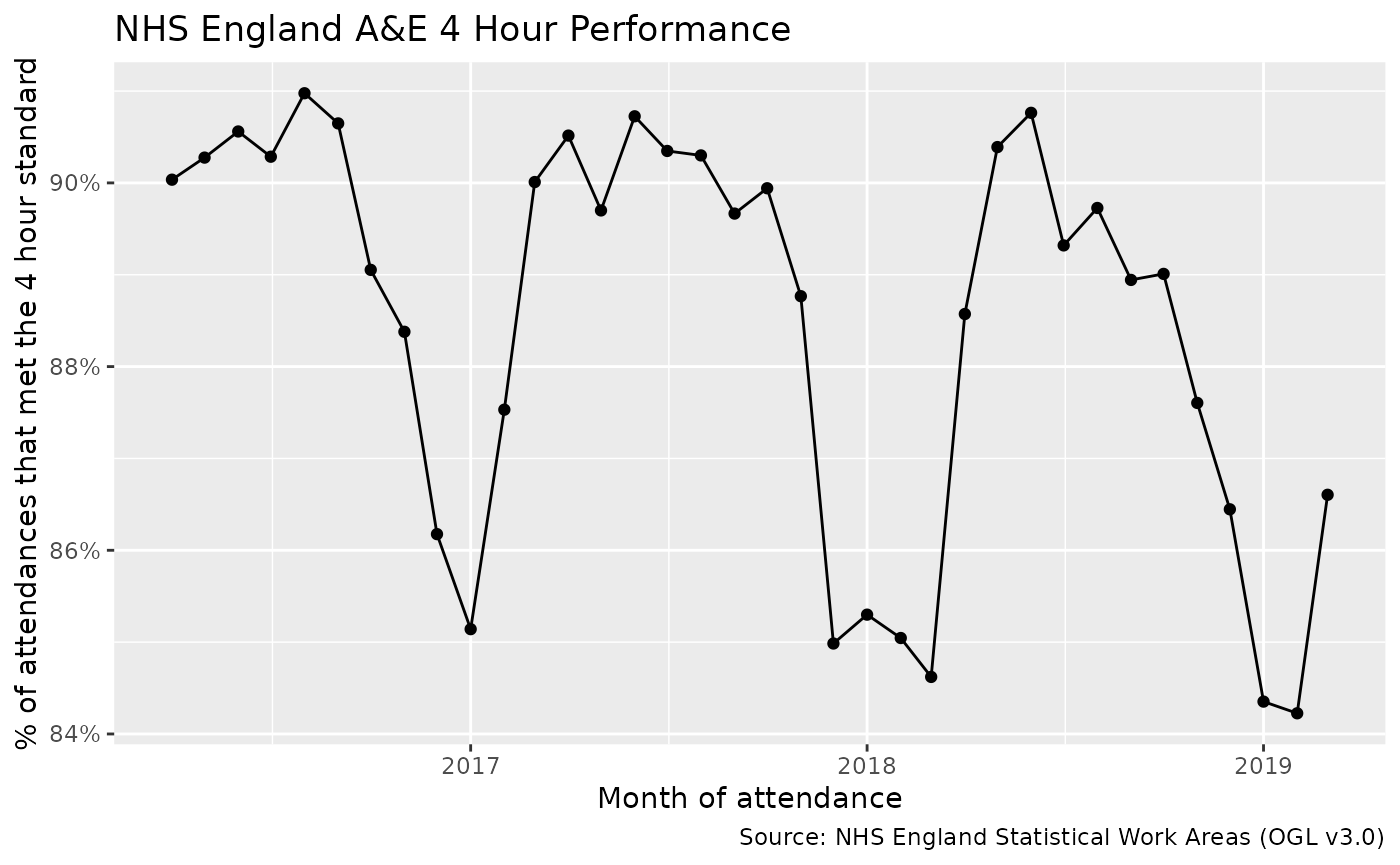
We can clearly see the “Winter Pressures” where performance drops.
We can also inspect performance for the different types of department:
ae_attendances %>%
  group_by(period, type) %>%
  summarise_if(is.numeric, sum) %>%
  mutate(performance = 1 - breaches / attendances) %>%
  ggplot(aes(period, performance, colour = type)) +
  geom_line() +
  geom_point() +
  scale_y_continuous(labels = percent) +
  # facet_wrap(vars(type), nrow = 1) +
  theme(legend.position = "bottom") +
  labs(
    x = "Month of attendance",
    y = "% of attendances that met the 4 hour standard",
    title = "NHS England A&E 4 Hour Performance",
    subtitle = "By Department Type",
    caption = "Source: NHS England Statistical Work Areas (OGL v3.0)"
  )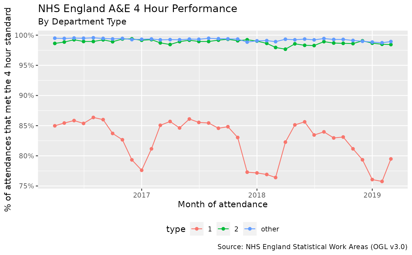
From this it appears as if only the type 1 departments have the seasonal drops, type 2 and “other” departments remain pretty consistent.
What are the best and worst trusts for performance?
We could create a similar table of data for performance by each individual trust, but it would be useful to only look at trusts that have a type 1 department as it appears from the chart above that these departments have the largest variation.
performance_by_trust <- ae_attendances %>%
  group_by(org_code, period) %>%
  # make sure that this trust has a type 1 department
  filter(any(type == 1)) %>%
  summarise_at(vars(attendances, breaches), sum) %>%
  mutate(performance = 1 - breaches / attendances)

# format for display
performance_by_trust %>%
  mutate_at(vars(period), format, "%b-%y") %>%
  mutate_at(vars(attendances, breaches), comma) %>%
  mutate_at(vars(performance), percent) %>%
  head(10) %>%
kable()| org_code | period | attendances | breaches | performance |
|---|---|---|---|---|
| R0A | Oct-17 | 35,744 | 3,663 | 89.7521% |
| R0A | Nov-17 | 34,314 | 3,982 | 88.3954% |
| R0A | Dec-17 | 34,082 | 5,430 | 84.0678% |
| R0A | Jan-18 | 33,758 | 4,906 | 85.4671% |
| R0A | Feb-18 | 30,520 | 4,111 | 86.5301% |
| R0A | Mar-18 | 35,233 | 5,496 | 84.4010% |
| R0A | Apr-18 | 33,127 | 3,809 | 88.5018% |
| R0A | May-18 | 35,797 | 4,792 | 86.6134% |
| R0A | Jun-18 | 34,070 | 3,616 | 89.3866% |
| R0A | Jul-18 | 35,081 | 4,723 | 86.5369% |
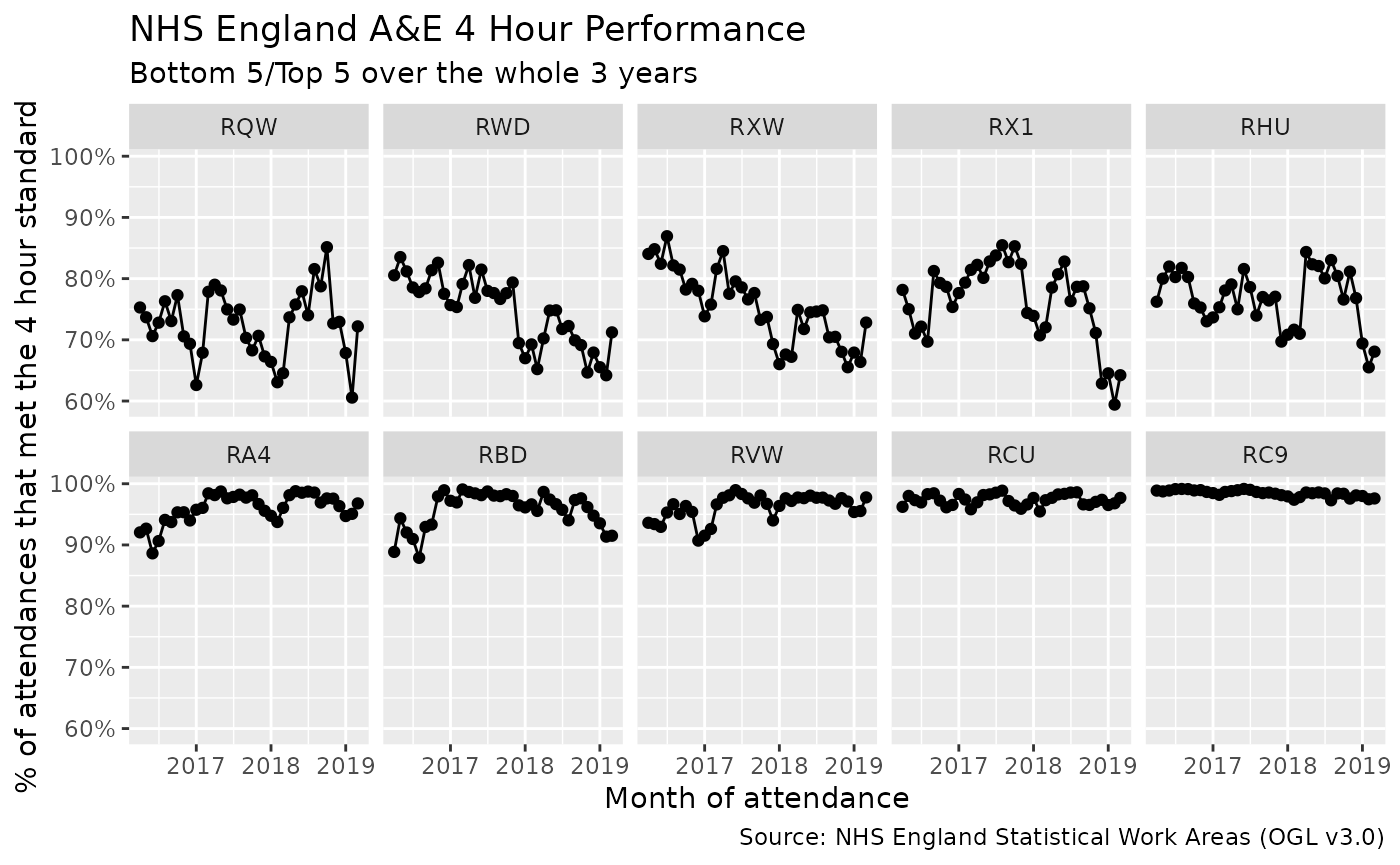
From this table we can calculate the overall performance by each trust and then organise the trusts by their overall performance.
performance_by_trust_ranking <- performance_by_trust %>%
  summarise(performance = 1 - sum(breaches) / sum(attendances)) %>%
  arrange(performance) %>%
  pull(org_code) %>%
  as.character()

print("Bottom 5")
#> [1] "Bottom 5"
head(performance_by_trust_ranking, 5)
#> [1] "RQW" "RWD" "RXW" "RX1" "RHU"

print("Top 5")
#> [1] "Top 5"
tail(performance_by_trust_ranking, 5)
#> [1] "RA4" "RBD" "RVW" "RCU" "RC9"
performance_by_trust %>%
  ungroup() %>%
  mutate_at(vars(org_code), fct_relevel, performance_by_trust_ranking) %>%
  filter(org_code %in% c(
    head(performance_by_trust_ranking, 5),
    tail(performance_by_trust_ranking, 5)
  )) %>%
  ggplot(aes(period, performance)) +
  geom_line() +
  geom_point() +
  scale_y_continuous(labels = percent) +
  facet_wrap(vars(org_code), nrow = 2) +
  theme(legend.position = "bottom") +
  labs(
    x = "Month of attendance",
    y = "% of attendances that met the 4 hour standard",
    title = "NHS England A&E 4 Hour Performance",
    subtitle = "Bottom 5/Top 5 over the whole 3 years",
    caption = "Source: NHS England Statistical Work Areas (OGL v3.0)"
  )
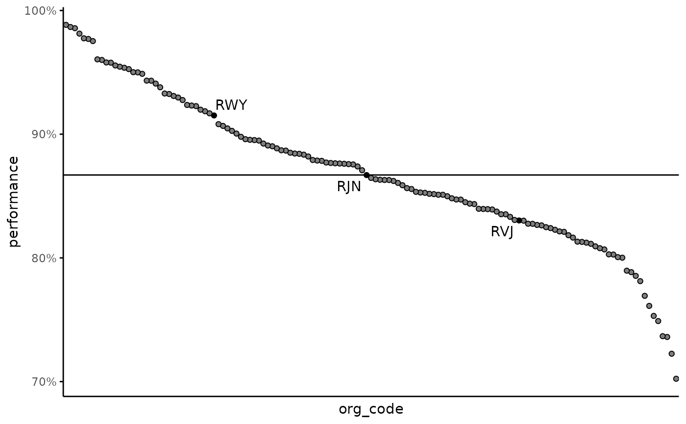
Benchmarking
It is sometimes useful to see how an organisation stacks up against all of the other organisations. Below we create a chart where each organisation is shown as a point, ordered by performance from left (highest performance) to right (lowest) performance.
It’s useful to indicate certain organisations on the chart, below I
am showing the 3 organisations that are at the lower quartile, median
and upper quartile, however you could change this to instead pick out
specific organisations (using a reference table and
left_join or hard coding with case_when).
ae_attendances %>%
  filter(period == last(period)) %>%
  group_by(org_code) %>%
  filter(any(type == 1)) %>%
  summarise_at(vars(attendances, breaches), sum) %>%
  mutate(
    performance = 1 - breaches / attendances,
    overall_performance = 1 - sum(breaches) / sum(attendances),
    org_code = fct_reorder(org_code, -performance)
  ) %>%
  #
  arrange(performance) %>%
  # lets highlight the organsiations that are at the lower and upper quartile
  # and at the median. First "tile" the data into 4 groups, then we use the
  # lag function to check to see if the value changes between rows. We will get
  # NA for the first row, so replace this with FALSE
  mutate(
    highlight = ntile(n = 4),
    highlight = replace_na(highlight != lag(highlight), FALSE)
  ) %>%
  ggplot(aes(org_code, performance)) +
  geom_hline(aes(yintercept = overall_performance)) +
  geom_point(aes(fill = highlight), show.legend = FALSE, pch = 21) +
  geom_text_repel(aes(label = ifelse(highlight, as.character(org_code), NA)),
    na.rm = TRUE
  ) +
  scale_fill_manual(values = c(
    "TRUE" = "black",
    "FALSE" = NA
  )) +
  scale_y_continuous(labels = percent) +
  theme_minimal() +
  theme(
    panel.grid = element_blank(),
    axis.text.x = element_blank(),
    axis.line = element_line(),
    axis.ticks.y = element_line()
  )