NHS England Accident & Emergency Attendances and Admissions
Source:R/ae_attendances.R
ae_attendances.RdReported attendances, 4 hour breaches and admissions for all A&E departments in England for the years 2016/17 through 2018/19 (Apr-Mar). The data has been tidied to be easily usable within the tidyverse of packages.
data(ae_attendances)Format
Tibble with six columns
- period
The month that this data relates to
- org_code
The ODS code for this provider
- type
The department type. either 1, 2 or other
- attendances
the number of patients who attended this department in this month
- breaches
the number of patients who breaches the 4 hour target in this month
- admissions
the number of patients admitted from A&E to the hospital in this month
Details
Data sourced from NHS England Statistical Work Areas which is available under the Open Government Licence v3.0
Examples
data(ae_attendances)
library(dplyr)
#>
#> Attaching package: ‘dplyr’
#> The following objects are masked from ‘package:stats’:
#>
#> filter, lag
#> The following objects are masked from ‘package:base’:
#>
#> intersect, setdiff, setequal, union
library(ggplot2)
library(scales)
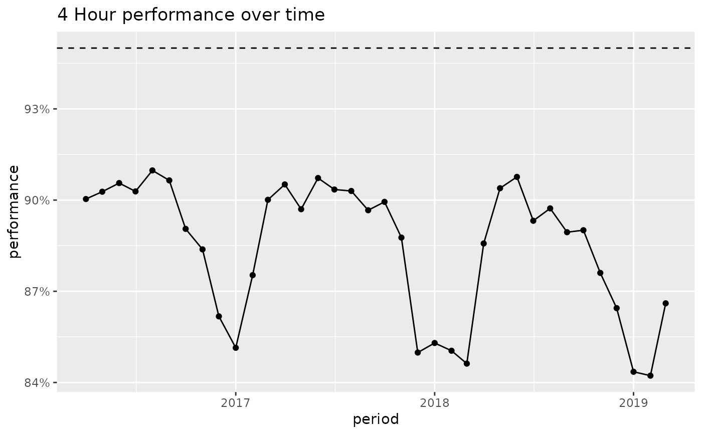
# Create a plot of the performance for England over time
ae_attendances %>%
group_by(period) %>%
summarise_at(vars(attendances, breaches), sum) %>%
mutate(performance = 1 - breaches / attendances) %>%
ggplot(aes(period, performance)) +
geom_hline(yintercept = 0.95, linetype = "dashed") +
geom_line() +
geom_point() +
scale_y_continuous(labels = percent) +
labs(title = "4 Hour performance over time")
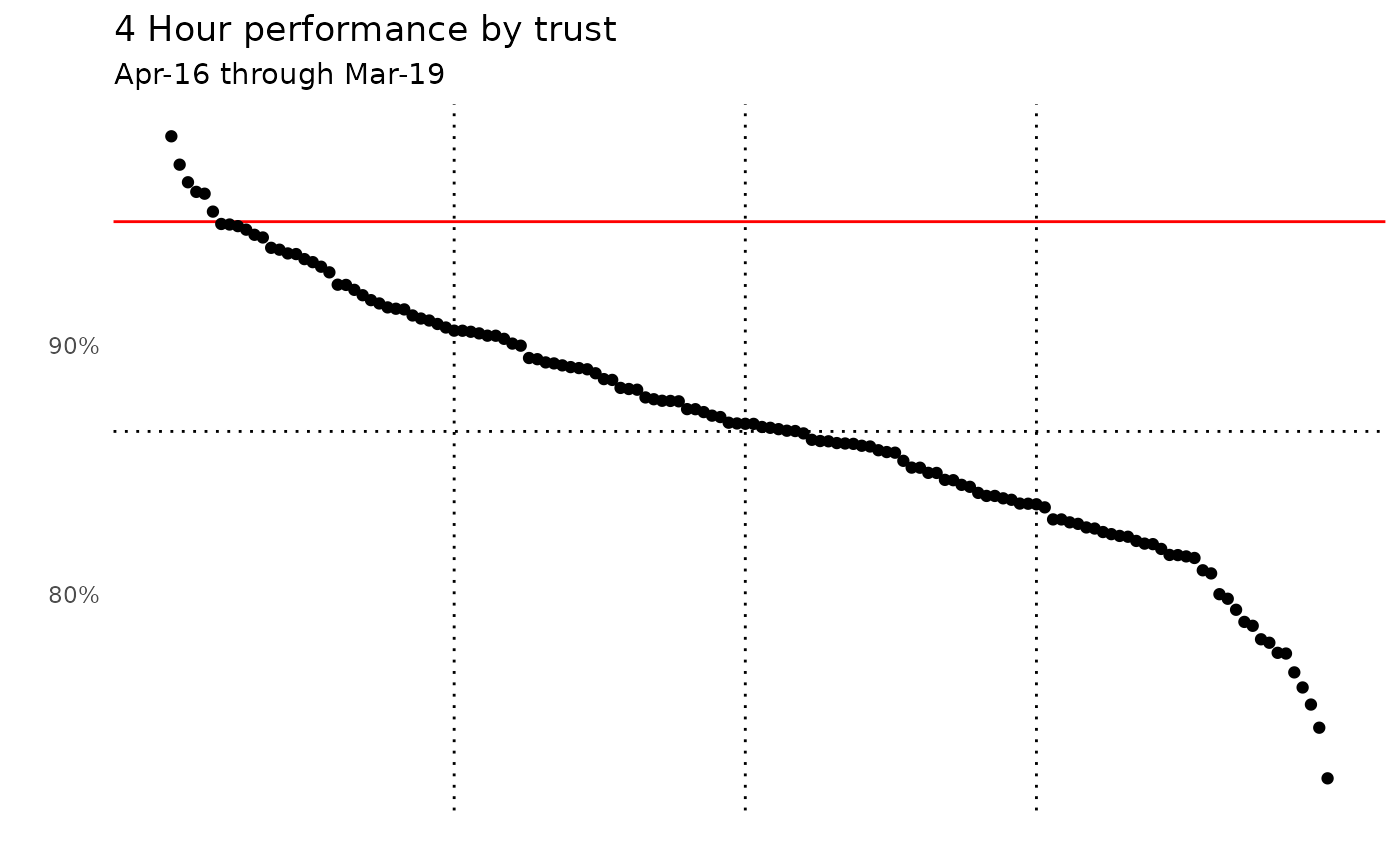
 # Now produce a plot showing the performance of each trust
ae_attendances %>%
group_by(org_code) %>%
# select organisations that have a type 1 department
filter(any(type == "1")) %>%
summarise_at(vars(attendances, breaches), sum) %>%
arrange(desc(attendances)) %>%
mutate(
performance = 1 - breaches / attendances,
overall_performance = 1 - sum(breaches) / sum(attendances),
rank = rank(-performance, ties.method = "first") / n()
) %>%
ggplot(aes(rank, performance)) +
geom_vline(xintercept = c(0.25, 0.5, 0.75), linetype = "dotted") +
geom_hline(yintercept = 0.95, colour = "red") +
geom_hline(aes(yintercept = overall_performance), linetype = "dotted") +
geom_point() +
scale_y_continuous(labels = percent) +
theme_minimal() +
theme(
panel.grid = element_blank(),
axis.text.x = element_blank()
) +
labs(
title = "4 Hour performance by trust",
subtitle = "Apr-16 through Mar-19",
x = "", y = ""
)
# Now produce a plot showing the performance of each trust
ae_attendances %>%
group_by(org_code) %>%
# select organisations that have a type 1 department
filter(any(type == "1")) %>%
summarise_at(vars(attendances, breaches), sum) %>%
arrange(desc(attendances)) %>%
mutate(
performance = 1 - breaches / attendances,
overall_performance = 1 - sum(breaches) / sum(attendances),
rank = rank(-performance, ties.method = "first") / n()
) %>%
ggplot(aes(rank, performance)) +
geom_vline(xintercept = c(0.25, 0.5, 0.75), linetype = "dotted") +
geom_hline(yintercept = 0.95, colour = "red") +
geom_hline(aes(yintercept = overall_performance), linetype = "dotted") +
geom_point() +
scale_y_continuous(labels = percent) +
theme_minimal() +
theme(
panel.grid = element_blank(),
axis.text.x = element_blank()
) +
labs(
title = "4 Hour performance by trust",
subtitle = "Apr-16 through Mar-19",
x = "", y = ""
)