The overall intent of this package is to mimic as completely as possible the output available from the NHSEI Making Data Count Excel tools. However, we have identified some areas where the R implementation should deviate from the main Excel tools. We have done this only after careful consideration, and we believe there is a benefit to deviating.
This vignette documents what these differences are, and how to set options to over-ride them, so that if you need to you can completely replicate the output that the Excel tools would create.
You may consider this important if for example you are publishing outputs from both the Excel tool and this R tool, and need the outputs to be completely consistent.
List of Deviations
1. Treatment of outlying points
By default, this package will screen outlying points, removing them from the moving range calculation, and hence from the process limits calculation. This is in line with the published paper:
Nelson, Lloyd S. (1982) Control Charts for Individual Measurements, Journal of Quality Technology 14(3): 172-173
It is discussed further in the book:
Provost, Lloyd P. & Murray, Sandra K. (2011) The Health Care Data Guide: Learning from Data for Improvement, San Francisco, CA: Jossey-Bass, pp.155, 192
The “Making Data Count” Excel tools do not screen outlying points, and all points are included in the moving range and limits calculations. If outlying points exist, the process limits on the Excel tools will therefore be wider than if outlying points were screened from the calculation.
This behaviour is controlled by the screen_outliers
argument. By default, screen_outliers = TRUE.
To replicate the Excel method, set the argument
screen_outliers = FALSE.
The two charts below demonstrate the default, and how to over-ride to replicate the Excel tools.
R Package Default:
data <- c(1, 2, 1, 2, 10, 1, 2, 1, 2, 1, 2, 1, 2, 1, 2, 1, 2, 1)
date <- seq(as.Date("2021-03-22"), by = 1, length.out = 18)
df <- tibble::tibble(data, date)

# screen_outliers = TRUE by default
spc_data <- ptd_spc(df, value_field = data, date_field = date)
spc_data %>%
  plot() +
  labs(
    caption = paste(
      "UPL = ", round(spc_data$upl[1], 2),
      ", Mean = ", round(spc_data$mean_col[1], 2),
      ", LPL = ", round(spc_data$lpl[1], 2)
    )
  )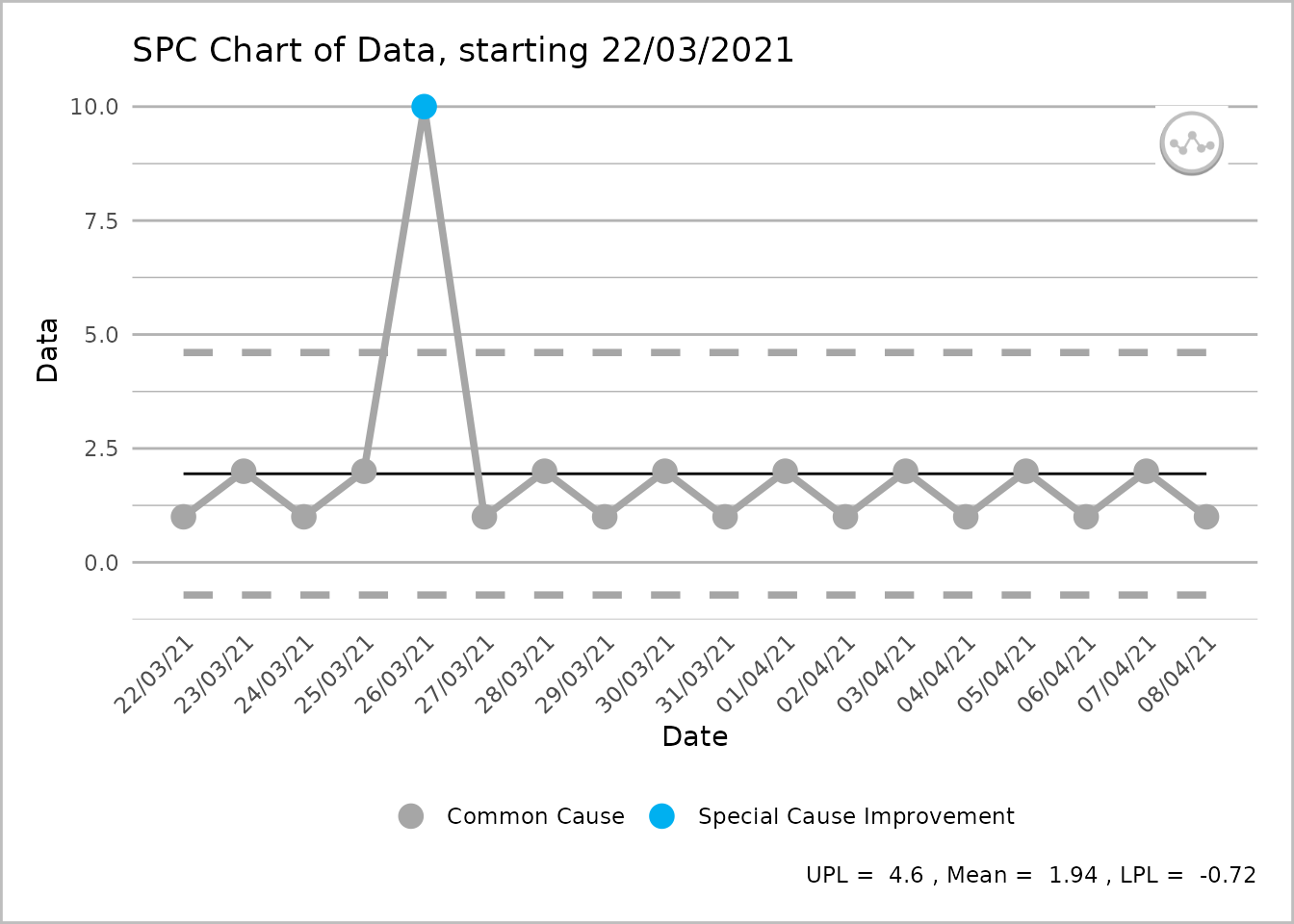
An SPC chart labelled ‘Data’ on the y-axis, with dates from 22 March 2021 to 8 April 2021, at 1-day intervals, on the x-axis. From left to right the line shows four grey common cause points followed by a single blue special cause improvement point followed by a further 12 grey common cause points. A caption reports the upper process limit as 4.6, the mean as 1.94 and the lower process limit as -0.72.
Over-riding to replicate “Making Data Count” Excel output:
# setting screen_outliers = FALSE produces the same output as Excel
spc_data <- ptd_spc(df, value_field = data, date_field = date, screen_outliers = FALSE)
spc_data %>%
  plot() +
  labs(
    caption = paste(
      "UPL = ", round(spc_data$upl[1], 2),
      ", Mean = ", round(spc_data$mean_col[1], 2),
      ", LPL = ", round(spc_data$lpl[1], 2)
    )
  )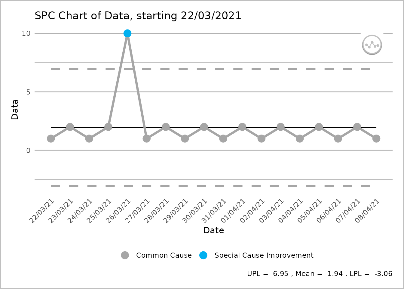
An SPC chart labelled ‘Data’ on the y-axis, with dates from 22 March 2021 to 8 April 2021, at 1-day intervals, on the x-axis. From left to right the line shows four grey common cause points followed by a single blue special cause improvement point followed by a further 12 grey common cause points. A caption reports the upper process limit as 6.95, the mean as 1.94 and the lower process limit as -3.06.
2. Breaking of lines
By default, this package will break process and limit lines when a plot is rebased. The Excel tool draws all lines as continuous lines. However, rebasing is a change to the process, so by breaking lines it more clearly indicates that a change in process has happened.
This can be controlled with the break_lines argument.
There are 4 possible values:
- “both” (default)
- “limit” (to just break the limit lines, but leave the process line connected)
- “process” (to just break the process line, but leave the limit lines connected)
- “none” (as per the Excel tool).
Examples of these 4 are shown below:
R Package Default:
spc_data <- ae_attendances %>%
  group_by(period) %>%
  summarise(across(attendances, sum)) %>%
  ptd_spc(attendances, period, rebase = as.Date(c("2017-04-01", "2018-04-01")))
#> Warning in ptd_add_short_group_warnings(.): Some groups have 'n < 12'
#> observations. These have trial limits, which will be revised with each
#> additional observation until 'n = fix_after_n_points' has been reached.

plot(spc_data, break_lines = "both")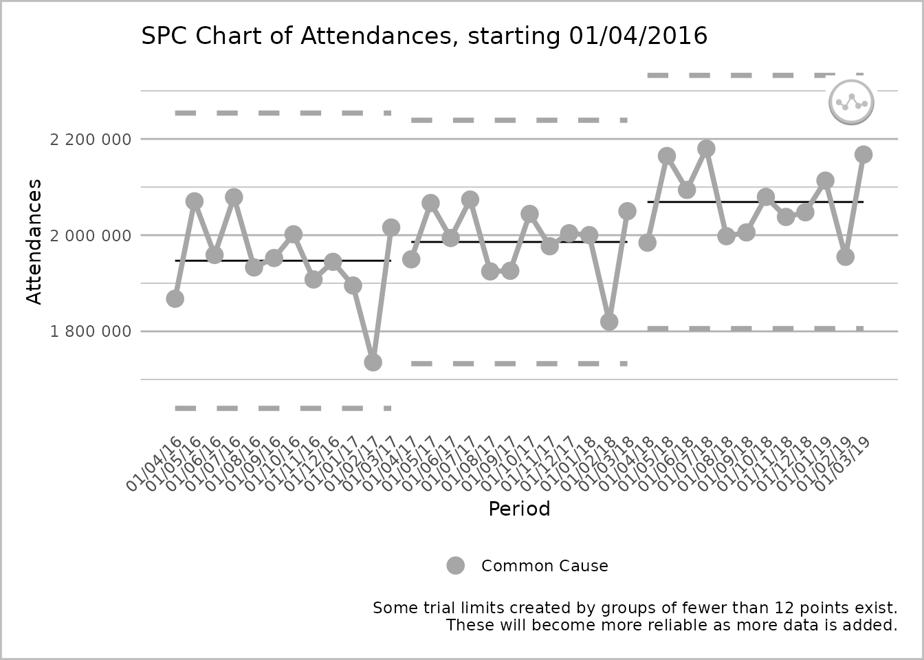
An SPC chart labelled ‘Attendances’ on the y-axis, with dates from 1 April 2016 to 1 March 2019, at 1-month intervals, on the x-axis. The dates are presented at 45 degrees to the x-axis. The line chart has three sections, each with twelve grey common cause points on the process line. Each section has its own upper process limit, mean, and lower process limit lines, that are not connected to the lines of another section. The process line is also split into three sections. A caption states ‘Some trial limits created by groups of fewer than 12 points exist. These will become more reliable as more data is added.’
Just breaking the limit lines:
plot(spc_data, break_lines = "limits")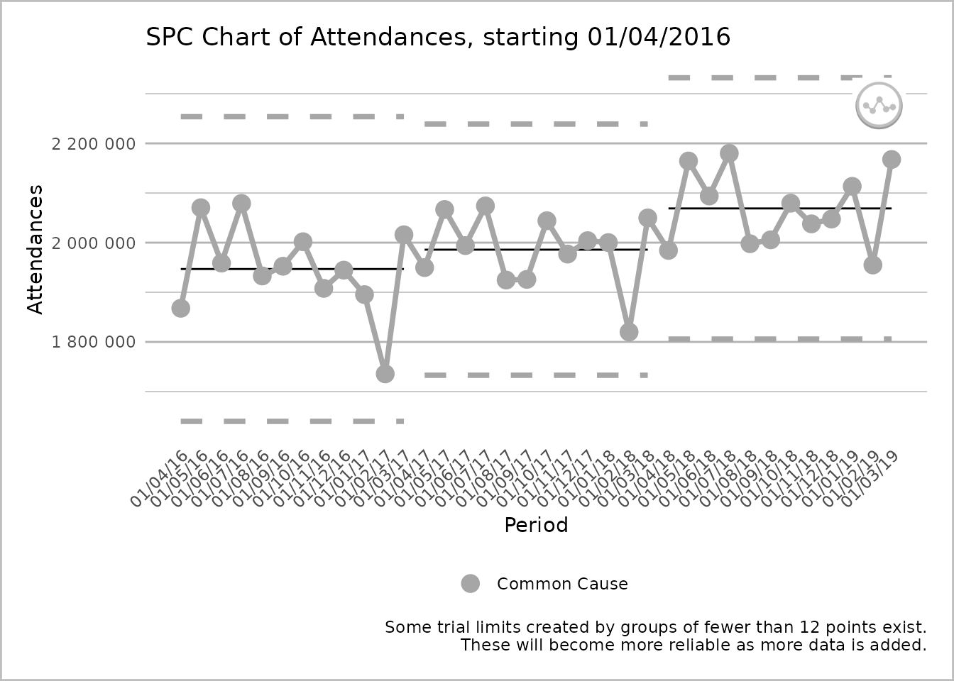
An SPC chart labelled ‘Attendances’ on the y-axis, with dates from 1 April 2016 to 1 March 2019, at 1-month intervals, on the x-axis. The line chart has three sections, each with twelve grey common cause points on the process line. Each section has its own upper process limit, mean, and lower process limit lines, that are not connected to the lines of another section. The process line is unbroken. A caption states ‘Some trial limits created by groups of fewer than 12 points exist. These will become more reliable as more data is added.’
Just breaking the process line:
plot(spc_data, break_lines = "process")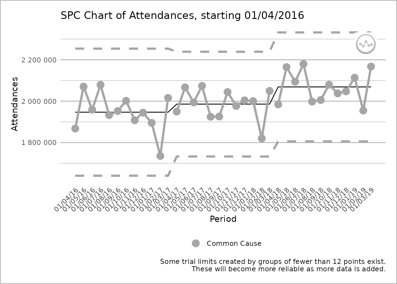
An SPC chart labelled ‘Attendances’ on the y-axis, with dates from 1 April 2016 to 1 March 2019, at 1-month intervals, on the x-axis. The line chart has three sections, each with twelve grey common cause points on the process line. Each section has its own upper process limit, mean, and lower process limits, but the lines for these are unbroken between sections. The process line is however broken between sections. A caption states ‘Some trial limits created by groups of fewer than 12 points exist. These will become more reliable as more data is added.’
Over-riding to replicate “Making Data Count” Excel output:
plot(spc_data, break_lines = "none")
An SPC chart labelled ‘Attendances’ on the y-axis, with dates from 1 April 2016 to 1 March 2019, at 1-month intervals, on the x-axis. The line chart has three sections, each with twelve grey common cause points on the process line. Each section has its own upper process limit, mean, and lower process limits, but the lines for these are unbroken between sections. The process line is also unbroken between the sections. A caption states ‘Some trial limits created by groups of fewer than 12 points exist. These will become more reliable as more data is added.’
3. X Axis Text Angle
As can be seen in the plots above, by default this package will print x axis text rotated by 45 degrees for better utilisation of space, and readability. Excel’s behaviour is to print this text at 90 degrees to the axis.
Text angle can be over-ridden by passing a ggplot
theme() into the theme_override argument of
the plot function. Any of the modifications documented in the ggplot2 theme
documentation can be made, but in this case we just need to modify
axis.text.x.
To re-instate 90 degree axis text:
ae_attendances %>%
  group_by(period) %>%
  summarise(across(attendances, sum)) %>%
  ptd_spc(attendances, period) %>%
  plot(theme_override = theme(axis.text.x = element_text(angle = 90)))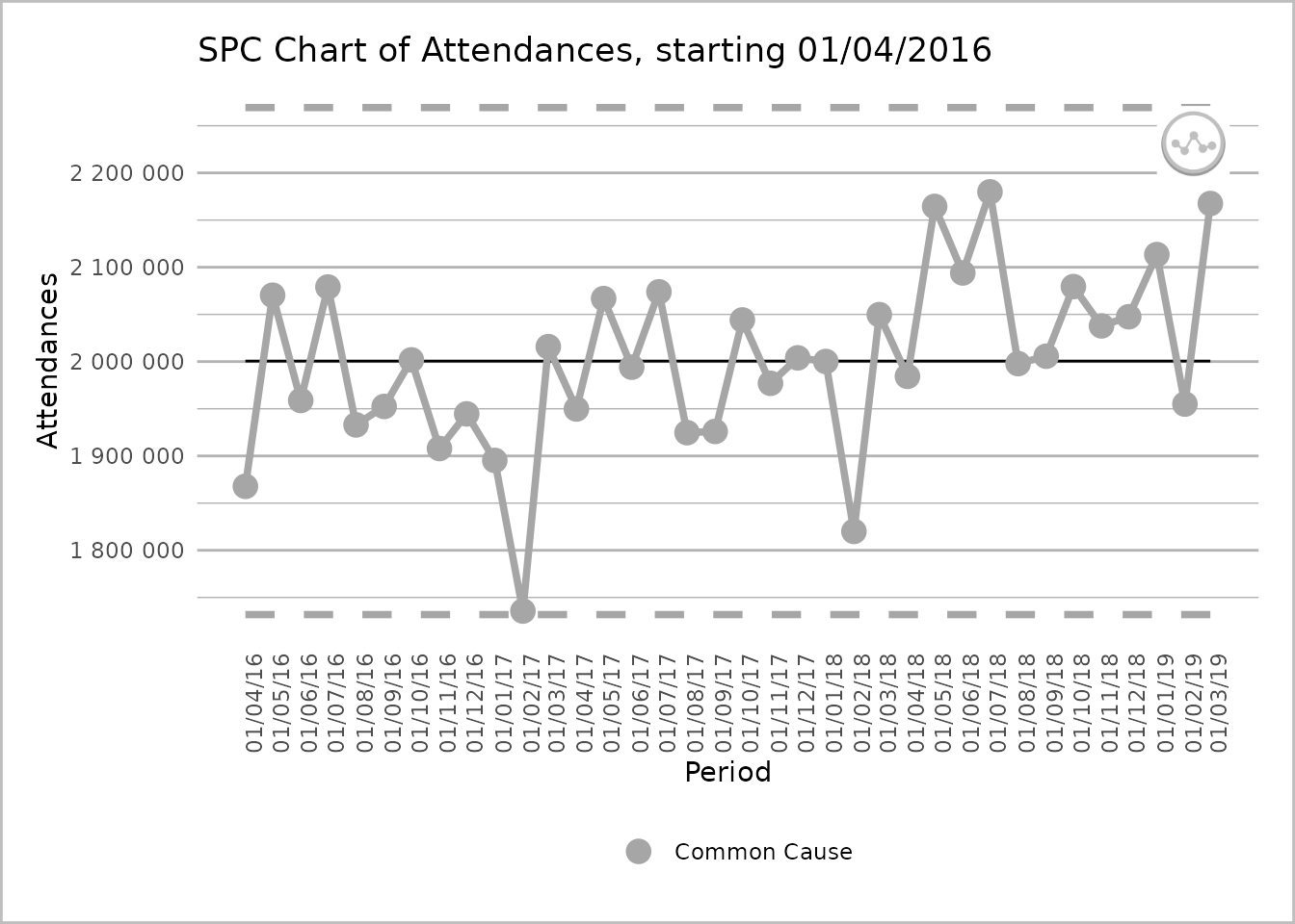
An SPC chart labelled ‘Attendances’ on the y-axis, with dates from 1 April 2016 to 1 March 2019, at 1-month intervals, on the x-axis. The dates are presented at 90 degrees to the x-axis. The line chart has 36 grey common cause points on the process line. There are dashed lines for the upper and lower process limits and a solid line for the mean.
Find the package code on GitHub.