Funnel plots
Funnel plots are a common tool for comparing organisations or units using proportions or standardised rates. A common use of them is for monitoring mortality at hospitals. This is an introductory post on the subject, that gives a little information about them and how they are constructed. It is deliberately light on theory, focusing on use, some of the theory is referenced for interested readers.
There are different kinds of funnel plot, for this vignette, we will focuses on the type used to compare standardised mortality and other similarly constructed indicators.
Why do we use them?
Rationale
How do you go about comparing organisations? We could simply look at indicator data and rank them, but that could be unfair if the conditions are different at each organisation. E.g. every hospital differs in size, the services it offers, and the patients it sees. We might expect a hospital seeing a higher proportion of elderly patients to have a higher mortality rate. Is it fair to compare it to an organisation serving a younger population who may be ‘healthier’ in general? Naively comparing organisations by ranking in league tables has been shown to be a bad idea (Goldstein and Spiegelhalter, 1996; Lilford et al., 2004).
This scenario is not a million miles away from the techniques used in meta-analysis of clinical trials, where we may have trials of different sizes, with different estimates of effect, and differing variances. Some of the techniques applied to meta-analysis have been adapted for healthcare monitoring, including funnel plots and methods to adjust for overdispersion (Spiegelhalter, 2005a, 2005b; Spiegelhalter et al., 2012).
Construction
If we want to compare a standardised ratio or similar indicator, we can make a plot with the indicator on the Y-axis, and a measure of the unit size on the X-axis. This is commonly the sum of the predicted values for standardised ratios (e.g. the predicted number of cases), or the number of patients/discharges etc. Our centre line, the average value, can be surrounded by ‘control limits,’ a concept from Statistical Process Control. These limits are statistical boundaries to separate natural (‘common-cause’) variation and systematic differences (‘special-cause variation’) (Mohammed et al., 2001). This is commonly at organisational level, but could be at any aggregation.
The reason these limits resemble a funnel is due to the effects of size. The expected variation is larger when we are looking at fewer cases. For example, imagine an experiment where we toss an unbiased coin to see the expected value. If we toss that coin twice and both are ‘heads,’ our data is telling us that all coin tosses end up as ‘heads.’ This is not true, and we are making an assumption that we know would be different if we repeated it more times. The margin of error around this is high. So if we performed the same experiment 10, 100 or 1000 times, we would expect it to become 50:50, heads/tails, and the margin of error is proportionally smaller. This is also true of indicators based on counts, like funnel plots. We expect less variation between points as organisations get larger.
Example:
library(ggplot2)
library(tidyr)

# Make up some data, as if it was from a regression model
# with observed and predicted (expected) events.
dt <-
  data.frame(
    observed = c(15, 40, 72, 28, 50, 66, 75),
    expected = c(13, 32, 75, 33, 54, 60, 72),
    unit = factor(c("A", "B", "c", "D", "E", "F", "G"))
  )

# Add a ratio (SR) of observed to expected, our indicator
dt$SR <- dt$observed / dt$expected

# Scatter plot in ggplot
a <-
  ggplot(dt, aes(x = expected, y = SR)) +
  geom_point()

a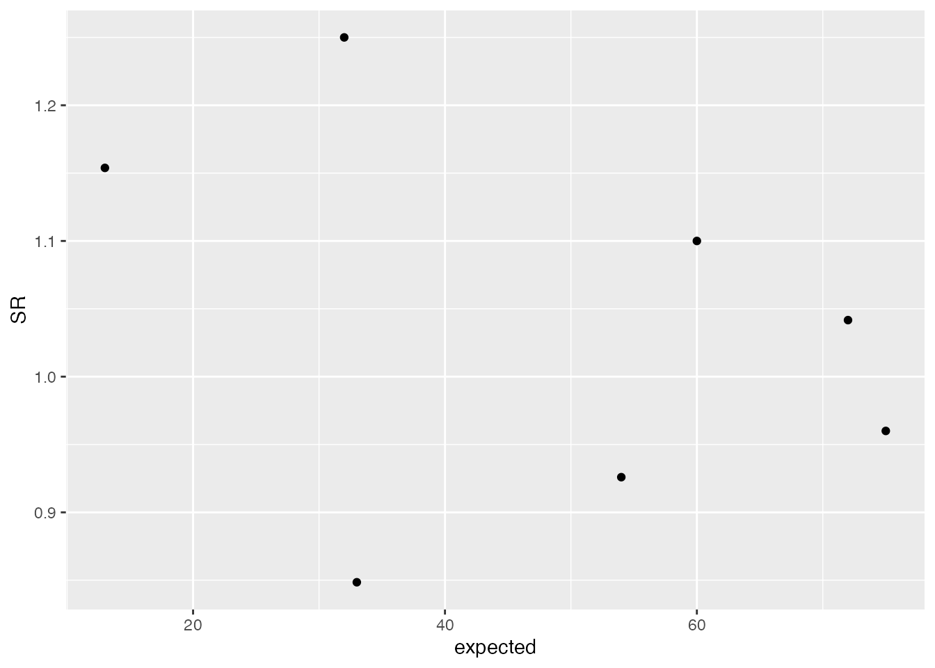
# Now add a central line, as 1 is the average/expected value in this case.
a <-
  a +
  geom_hline(aes(yintercept = 1))

a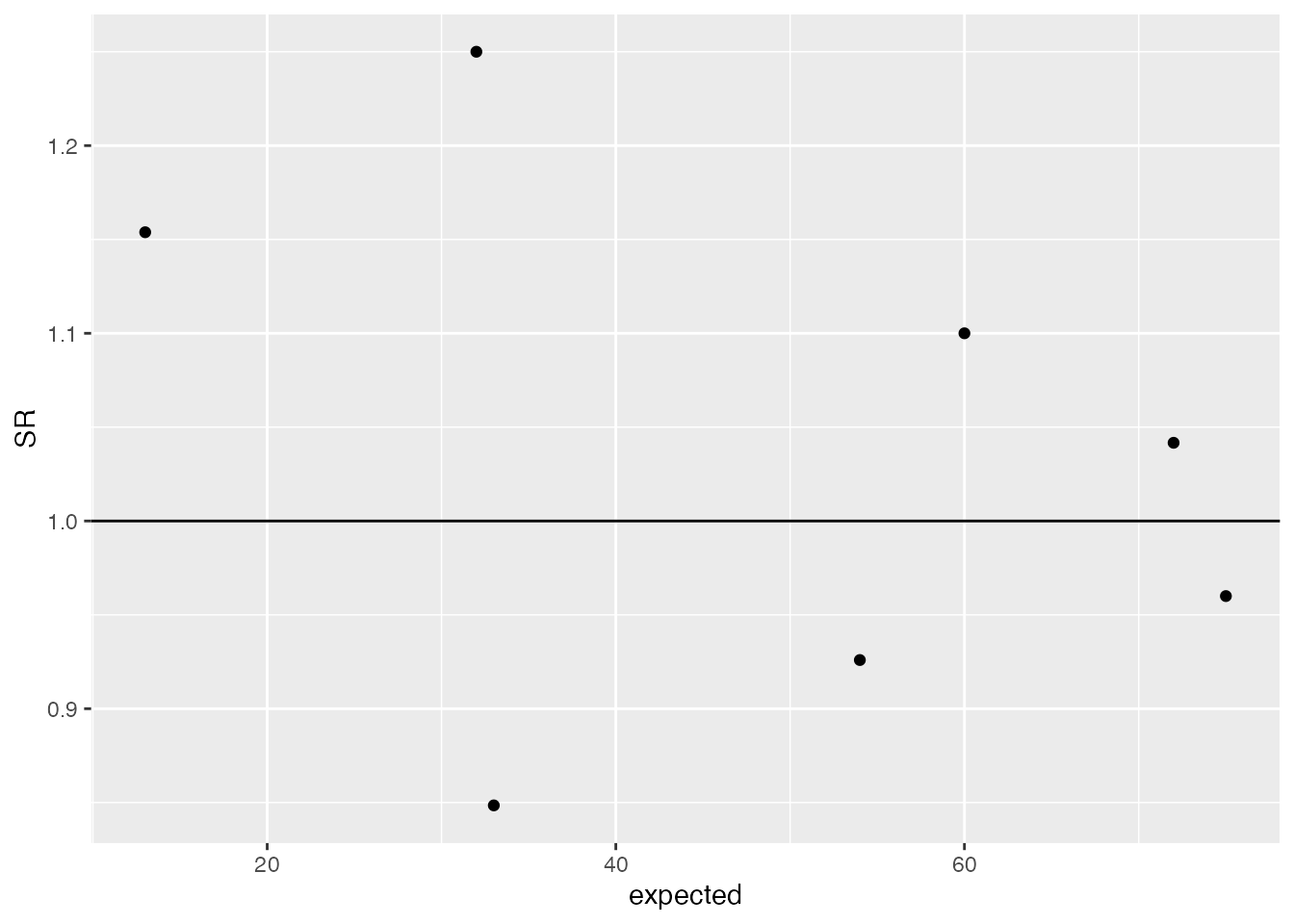
# Add a 95% Poisson limit, by using the density function to get the
# quantile value for each 'expected'.
lkup <- data.frame(id = seq(1, max(dt$expected), 1))
lkup$Upper <- (qpois(0.975, lambda = lkup$id) - 0.025) / lkup$id
lkup$lower <- (qpois(0.025, lambda = lkup$id) - 0.975) / lkup$id

lkup <- gather(lkup, key, value, -id)

a + geom_line(aes(x = id, y = value, col = key), data = lkup)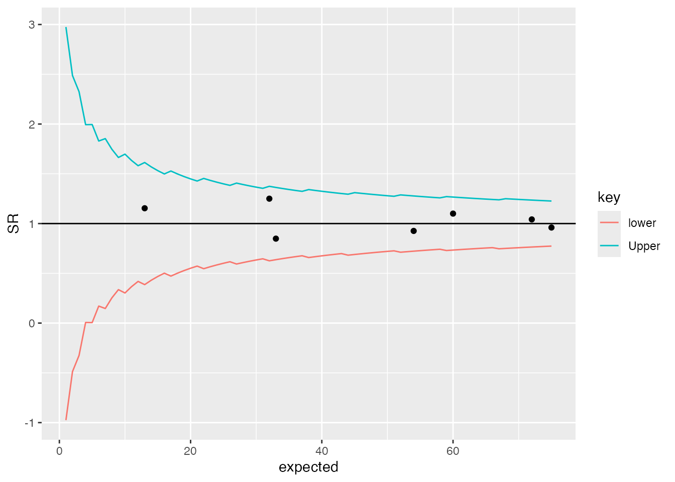
You’ll probably notice the ‘jagged’ lines in the plot above. This is because the Poisson distribution is only defined on integers, and most common implementations of Poisson functions make some sort of rounding/guess between points. They are generally poorly defined on low values, but there are other options that I’ll discuss in another future post.
Expanding limits
The methods described above have been developed into a basic R
package to draw these plots using ggplot2. It also allows
users to specify whether they want ‘overdispersed’ limits. I will write
another post about overdispersion in the coming weeks, but essentially,
we have more variation than we would expect from theory alone. To
account for this, we can estimate how much greater the variance in our
data is, and expand the funnel limits by this amount.
Part of this process involves ‘Winsorisation’ of the distribution (Spiegelhalter, 2005b; Spiegelhalter et al., 2012), where we set the outer most values to a defined percentile to reduce the effects of outliers. This is commonly set to 10% at each end of the distribution, but there is a variant method for this, used in the NHS’ Summary Hospital Mortality Indicator’, where the distribution is truncated instead of Winsorised (Clinical Indicators Team, 2018).
I originally wrote this package to present plots for my PhD thesis, focused on predicting NRLS incident reporting ratios after risk-adjustment. The overdispersion was particularly high in this case, and differences between the two methods were noticeable, with the SHMI/truncation method appearing better suited.
Application
Here we will apply this to some data by picking up the
medpar dataset discussed by Hilbe and available in the
COUNT package (Hilbe, 2014).
It is a set of data points from hospitals in Arizona, in 1991, based on
US Medicare data. We’ll use the ‘length of stay’ field ’,
los, and model it from the other predictors in the
data.
Basic model build
We will first load the data and build a simple predictive model, using a Poisson GLM, with a few of the predictors from the dataset. This post is not focused on modelling techniques, but a Poisson Generalised Linear Model (GLM) is more appropriate for count data than linear regression. The key message, though, is that Poisson models make no adjustment for the variance within the data and are likely to be overdispersed. A more sophisticated approach might use something like a negative binomial or multilevel model (discussed in a later post).
A little reformatting is required before modelling:
library(FunnelPlotR)
library(COUNT)
library(ggplot2)

data(medpar)
medpar$provnum <- factor(medpar$provnum)
medpar$los <- as.numeric(medpar$los)

mod <- glm(los ~ hmo + died + age80 + factor(type)
           , family = "poisson"
           , data = medpar)
summary(mod)
#>
#> Call:
#> glm(formula = los ~ hmo + died + age80 + factor(type), family = "poisson",
#>     data = medpar)
#>
#> Coefficients:
#>               Estimate Std. Error z value Pr(>|z|)
#> (Intercept)    2.26875    0.01246 182.011  < 2e-16 ***
#> hmo           -0.07637    0.02393  -3.192  0.00142 **
#> died          -0.24574    0.01826 -13.458  < 2e-16 ***
#> age80         -0.02141    0.02050  -1.045  0.29617
#> factor(type)2  0.24921    0.02099  11.871  < 2e-16 ***
#> factor(type)3  0.74869    0.02627  28.496  < 2e-16 ***
#> ---
#> Signif. codes:  0 '***' 0.001 '**' 0.01 '*' 0.05 '.' 0.1 ' ' 1
#>
#> (Dispersion parameter for poisson family taken to be 1)
#>
#>     Null deviance: 8901.1  on 1494  degrees of freedom
#> Residual deviance: 7977.7  on 1489  degrees of freedom
#> AIC: 13705
#>
#> Number of Fisher Scoring iterations: 5
Now we have a regression that we can use to get a predicted
los that we will compare to observed los:
medpar$prds <- predict(mod, type = "response")Build plot
Now we can build a funnel plot object with standard Poisson limits,
and outliers labelled. The function returns an S3 object, with various
methods including print(), outlier(),
limits(), source_data() etc. See the help
file: ?funnel_plot for more details.
funnel_plot(
  medpar, numerator = los, denominator = prds, group = provnum
  , title = "Length of Stay Funnel plot for `medpar` data"
  , draw_unadjusted = TRUE, draw_adjusted = FALSE
  , label = "outlier", limit = 99
)
#> Warning: ggrepel: 5 unlabeled data points (too many overlaps). Consider
#> increasing max.overlaps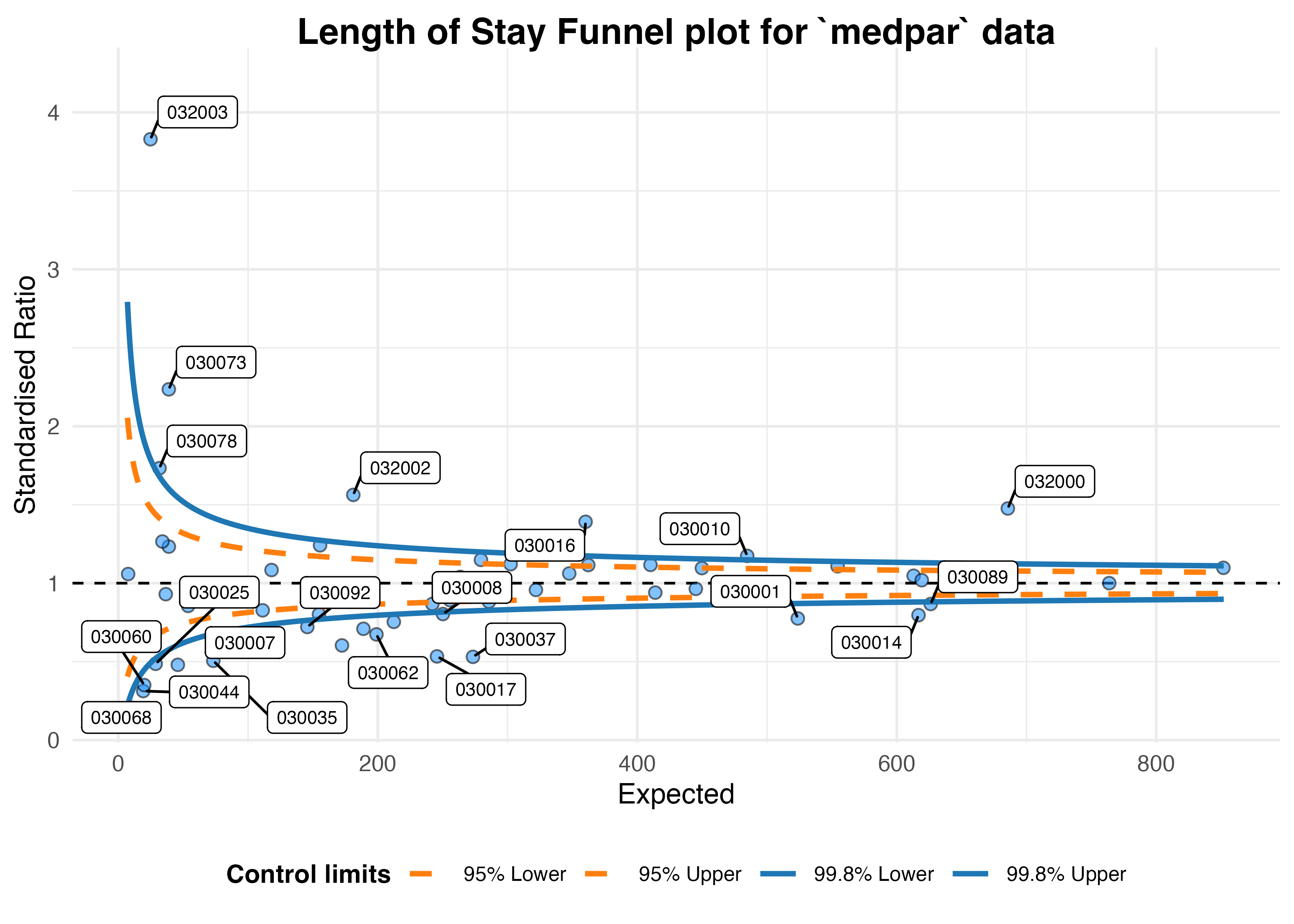
#> A funnel plot object with 54 points of which 25 are outliers.
#> Plot is not adjusted for overdispersion.
Overdispersion
That looks like too many outliers! There is more variation in our data than we would expect, and this is referred to as: overdispersion.
So lets check for it:
The following ratio should be 1 if
our data are conforming to Poisson distribution assumption (conditional
mean = variance). If it is greater than 1, we have overdispersion:
sum(mod$weights * mod$residuals^2) / mod$df.residual
#> [1] 6.240519
This suggests the variance is 6.24 times the condition mean, and definitely overdispersed. This is a huge topic, but applying overdispersed limits using either SHMI or Spiegelhalter methods adjust for this by inflating the limits:
funnel_plot(
  medpar, numerator = los, denominator = prds, group = provnum
  , title = "Length of Stay Funnel plot for `medpar` data"
  , draw_unadjusted = FALSE, draw_adjusted = TRUE, data_type = "SR"
  , sr_method = "SHMI", label = "outlier", limit = 99
)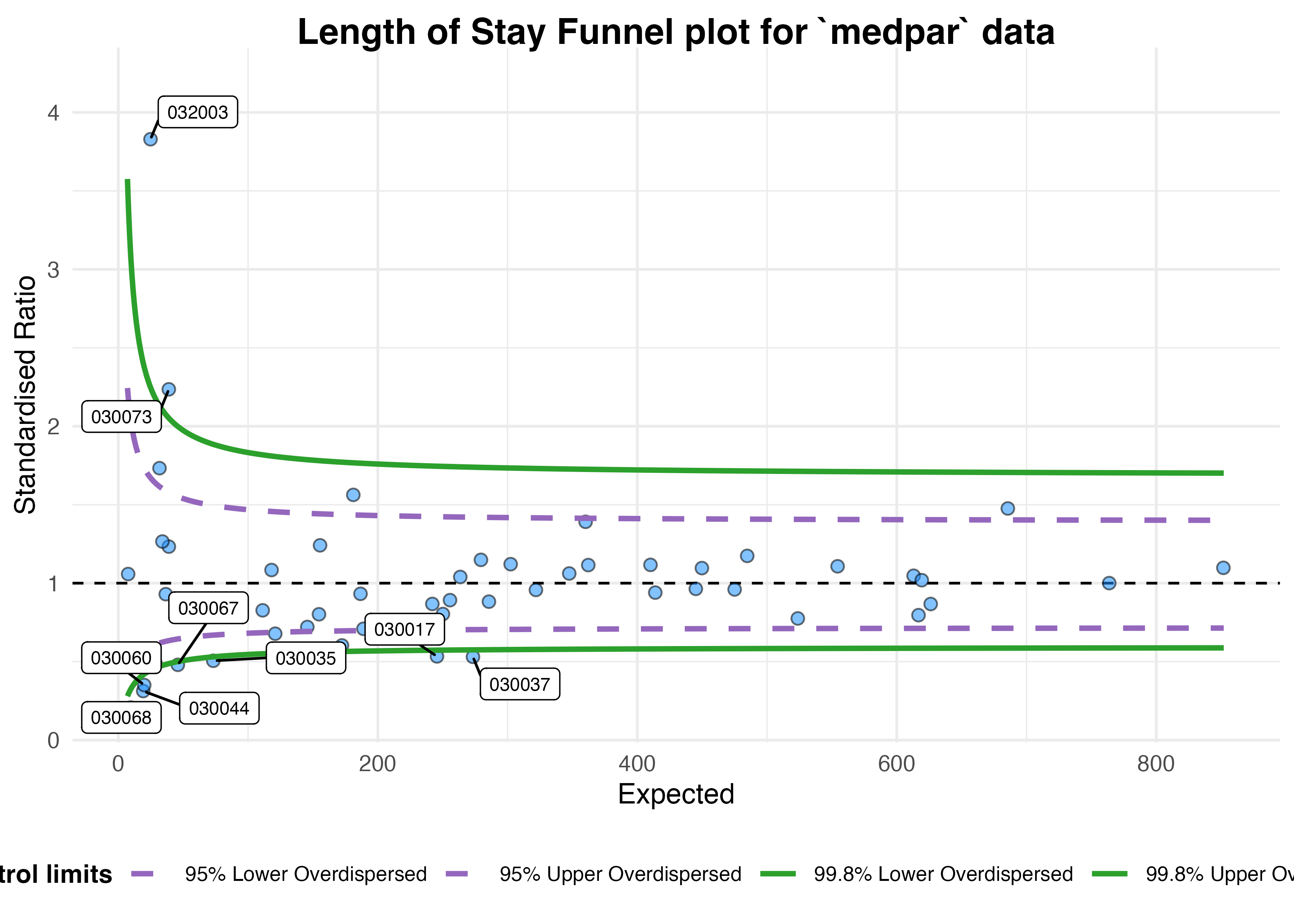
#> A funnel plot object with 54 points of which 9 are outliers.
#> Plot is adjusted for overdispersion.
Given these adjustments, we now only have nine organisations
showing special-cause variation. To interpret this plot properly, we
would first investigate these outlying organisations before making any
changes to the system/indicator. We should check for possible data
quality issues, such as errors, missing model predictors, environmental
factors (e.g. one organisation changing computer systems and data
standards etc. during the monitoring period), but once these are
examined we might suspect issues with care at the hospitals in question.
They can then be investigated by local audit and casenote review.
These methods can be used for any similar indicators, e.g. standardised mortality ratios, readmissions etc.
Summary
Funnel plots are useful ways to visualise indicators such as mortality, readmission and length of stay data at hospitals, that presents both the indicator value but also a measure of the size/variance at organisations. They allow limits to be drawn between what we might expect by chance, and what we might consider to be a signal for investigation. Organisations outside the funnel limits should be examined, first for data quality issues and then for issues with process and clinical care. Overdispersion means that these limits are often too strict, but they can be inflated to adjusted for this.